

Proposal Graphics: 13 Tips to Enhance Your Bid and Win Clients
Oct 5, 2023

Proposal graphic design is important because our brains (including your clients’ brains) process visual information better than they do text-filled blocks. But how can you include graphics in your proposals? This can be done with valuable and informative charts or tables throughout your proposal.
To truly have winning proposals and win clients, you need to do more than add nice graphics or pretty images— both, your graphics and text need to add value. So, instead of just making things look nice, use clear, engaging visuals that tell a captivating (and strategic) story about your brand and the solution you’re offering.
However, knowing how to successfully leverage project proposal graphic design to tell a story is not an easy task. In this blog, we’ll share 13 tips for having a stunning visual proposal to help you win more business. We also go over the why and when to use graphics and the different types of graphics you should be using in your proposals.
Why Use Graphics in Proposals?
Humans are innately visual. Studies show that we remember 80% of what we see, 20% of what we read, and 10% of what we hear. This also proves true when talking about graphics in proposals, making graphics a must-use element.
Complex information is often easier to understand when presented visually. A well-designed chart or infographic can convey details more quickly than paragraphs of text.
Furthermore, thanks to the Picture Superiority Effect, visuals are remembered more distinctly than written words. This image retention effect ensures that among a pile of proposals, yours stands out in a client’s memory.
Proposal graphics not only sustain reader engagement by breaking text monotony, but they also showcase professionalism and attention to detail. They simplify complex concepts, ensuring the client understands the proposal in its entirety.
Beyond data representation, the right visuals can lead to emotions like trust or excitement, slightly influencing the decision-making process.
When Do You Use Graphics in Proposals?
When adding graphics to your proposal, it’s important to know when and what type of graphics to use. Graphics should not be used simply to occupy space; they should enhance the proposal. Choose their positioning and content with a strategy in mind. This will help your visuals do more harm than good.
Choosing the right visuals to use can enhance comprehension and make your proposal more compelling. Here are instances when using proposal graphics can be beneficial:
- Data Representation: Whenever you’re presenting quantitative data, visuals like bar charts, pie charts, and line graphs can help simplify numbers and trends. This provides clear and instant insights.
- Explaining Processes: If your proposal outlines a complex process or workflow, flowcharts or process diagrams can illustrate each step clearly, showing how things connect and flow.
- Highlighting Benefits: Infographics are a great way to compare your offerings against competitors or to highlight the benefits of your proposed solution.
- Timeline Presentation: When you need to present a project timeline or milestones, a Gantt chart or a simple timeline graphic can offer a clear view of each stage of events and their durations.
- Visual Testimonials: Instead of listing client testimonials in a text format, use graphics with headshots or logos, paired with short, impactful quotes. This adds credibility and visually reinforces trust.
- Concept Visualization: For abstract concepts or ideas, visuals can help solidify them. Whether it’s a mock-up of a proposed product or a conceptual diagram, seeing is often understanding.
- Setting Mood and Tone: Sometimes, the objective isn’t to communicate data but to set a mood. Beautiful imagery, relevant photos, or even color palettes can create an emotional connection or convey a brand’s ethos.
Properly integrating graphics, not only makes your proposal more visually appealing but also improves its clarity, ensuring your message resonates with potential clients.
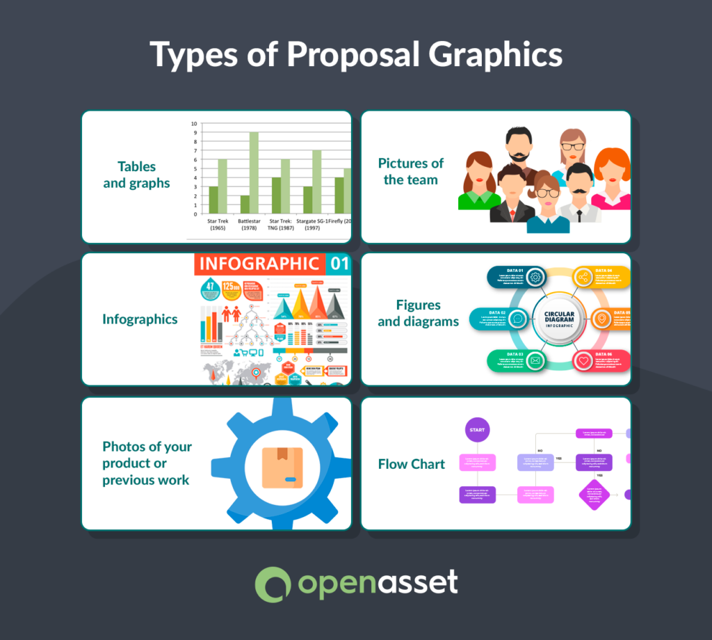
Types of Proposal Graphics
The use of visuals in a proposal can significantly affect how a proposal is portrayed. Depending on the information you’re presenting and the impression you want to make, various types of graphics can be used. This includes tables and graphs, infographics, photos of your product or previous projects, pictures of the team, figures and diagrams, and flow charts.
Let’s go into detail about each proposal graphics type.
Tables and Graphs
These are a must when presenting quantitative data in an easy-to-understand format. For example, they could be used in the following ways:
- Bar Graphs: Show the growth of completed construction projects over the years, indicating the firm’s expanding capacity.
- Pie Charts: Architectural firms can use these to present the mix of residential, commercial, and public projects in their portfolio.
- Tables: Engineers can detail project specifics like budget, materials, and duration, offering clients a quick overview of key data.
Whether it’s bar graphs, pie charts, or tables, these graphics offer clarity and immediate insight to the reader.
Pictures of the Team
Personalizing your proposal by showcasing the people behind the project can build trust. You can use an organizational chart that shows the proposed teams and management structures. Photos of team members, especially key players or those who’d be directly involved, can humanize your bid and make it more relatable.
Additionally, you’ll want to include headshots of your key staff in your RFP resumes to stand out from the competition. This can easily be done if you use a digital asset management (DAM) tool that offers a robust Employee Module feature.

Infographics
A blend of data and design, infographics are effective for summarizing complex information or processes. These help your readers “walk through” difficult ideas by outlining them in a graphic. They can quickly compare your offerings to competitors or highlight the key benefits of your solution in a visually appealing way.
Figures and Diagrams
When explaining difficult concepts, technical blueprints, or specific models, figures, and diagrams can clarify the information. They’re extremely useful for ensuring that the client fully understands complex details.
Photos of Your Product or Previous Projects
Demonstrate a product or service through visual aids. Showing is often more impactful than telling. High-quality photos of your product or previous projects can provide a concrete sense of what you offer and the quality of your work. This is especially true in the AEC industry.
AEC high-resolution photos you can include are:
- Completed Buildings: Showcasing exteriors from different angles and highlighting architectural features can emphasize your firm’s design skills and attention to detail.
- Interior Spaces: Photos of well-designed interiors, be it residential spaces, office layouts, or commercial areas, can provide a real sense of your team’s ability to create functional and aesthetically pleasing spaces.
- Before-and-After Shots: These are particularly powerful in the construction sector, demonstrating the transformation your firm can bring about. For a renovation project, for example, contrasting the initial state with the final result can be a testament to your team’s capabilities.
- Work in Progress: Images of construction sites in various stages, from initial ground-breaking to the laying of foundational elements, can offer insights into your team’s precision, safety measures, and organization.


Providing these visual insights reassures potential clients of your experience and track record in the industry.
Flow Charts
For processes, hierarchies, or workflows, flow charts should be your go-to graphics. They provide a visual map of how your firm’s proposed processes will happen and how the steps are connected, making it easier for the client to grasp the concept.
Tips for Using Graphics in Your Proposals
Visuals play a crucial role in improving the effectiveness and appeal of your proposals. Especially for AEC firms, visuals can present complex information in a digestible format. Here are 13 of the best practices for using proposal graphics:
1. Pay Attention to Page Count and Flow
When arranging graphics, consider the size and shape your graphic needs to be to stay within the page count limit how the text will wrap around it, and what text will be moved to the following page.
Typically, people read from left to right, top to bottom, and in graphics with multiple elements, often in a clockwise direction. Ensure your visuals guide the reader seamlessly in these patterns to enhance comprehension.
2. Use Action Captions
Instead of generic captions like “Figure 1”, which would be a waste of space, use ‘action captions’. For example, “Pedestrian-centric Layout: Safe walkways and communal spaces encourage walking, enhancing community well-being,” gives a direct understanding of the visual, adding value and creating instant context and relevance.
It highlights a specific aspect of the graphic and clarifies its advantage to the client. Even a reviewer who glances over the main content and focuses solely on the caption will grasp the primary benefit that sets your solution apart as the preferred choice.
3. Keep It Simple and Uncluttered
Cluttered visuals reduce the desired effect. While you may want to pack in information, crowded graphics can confuse the reader. Use white space strategically, and prioritize clarity over quantity of data. Placing white space around graphics and headings helps them to stand out.

Source: design shack
4. Use a Vertical (Portrait) Orientation for Your Graphics
In most proposals, a vertical orientation aligns better with the document’s layout, so your graphics are seamlessly integrated and easily viewable without requiring the reader to turn the page or make extra effort.
5. Follow Font Guidelines
Many proposals come with font guidelines, often specifying something like font type and size. Unless otherwise mentioned in the RFP, these guidelines pertain to both graphics and regular text. Therefore, if you use an older graphic set in a different font and size than the one in the guidelines, your proposal may not meet the standards and could face rejection.
Moreover, while graphics allow some flexibility, it’s essential to maintain consistent and legible fonts. This not only helps readability but also shows professionalism.
6. Add Efficiency to the Process With DAM
Boost efficiency by utilizing a DAM tool, especially when reusing graphics across various RFP responses. For example, if you have images that are applicable in multiple RFP responses you can use your DAM solution to build an efficient process that ensures the most up-to-date graphics go into every proposal.
Platforms like OpenAsset can ensure you always incorporate the latest and most relevant visuals in every proposal.
7. Use a Visual on Every (Or Every Other) Page
It’s commonly advised to feature at least one graphic on every proposal page, though having a visual on each page is preferable. This ensures sustained engagement and breaks textual monotony.
Graphics can either complement the text or even replace it entirely, ensuring a more straightforward communication of the message. Ideally, flipping through the visuals alone in your proposal should demonstrate the purpose of your story.
8. Follow Brand Guidelines
Following brand guidelines when incorporating proposal graphics ensures a cohesive and professional appearance. This uniformity makes the proposal immediately recognizable as being from your organization, leveraging on any established brand credibility.
Consistency in branding not only reflects a company’s attention to detail, building trust, but it also ensures that the graphics communicate effectively.
Moreover, consistently aligning with brand standards in all communications, including proposals, reinforces the brand image. This not only creates a lasting, positive impression but also helps in avoiding potential pitfalls or misunderstandings associated with inconsistent branding.
With a robust DAM system, you’ll have access to a centralized location for all branded assets. Plus, many DAM systems offer integrations with common design tools, making it easy for designers to pull assets directly into their work environment, ensuring they’re always using the correct, approved materials.
This ensures that everyone accesses the most up-to-date versions of logos, color palettes, typefaces, and other branding materials. This goes a long way in creating winning proposals.
9. Insert Tables, Charts, and Graphics
As mentioned earlier, tables, charts, and graphics transform complex data into digestible information, making it easier for clients to understand your value proposition and capabilities. Especially in proposals, where you’re competing for attention and aiming to make a lasting impression, these visual elements play an important role in allowing potential clients to grasp the essentials at a glance.
10. Design Graphics to Exact Dimensions
Design graphics at their actual display size. Avoid creating oversized images and then shrinking them, which can compromise clarity and quality.
New proposal graphic designers sometimes design a graphic in tools like PowerPoint or Illustrator using the right font size. However, when transferring it to the proposal document, they realize it’s oversized. The immediate reaction might be to downsize it to fit, but this makes the font undersized, making the graphic non-compliant with proposal guidelines.
Avoid condensing graphics for the sake of fitting them into the proposal. If they aren’t a perfect fit, it’s best to return to the original file and modify it there. Likewise, don’t enlarge small graphics directly in the proposal, as it results in a loss of clarity and sharpness. For optimal quality and compliance, always make size adjustments to the source tool.
A time-saving hack for proposal image management is implementing a DAM solution. An important DAM feature to look out for is the ability for automated resizing or reformatting. If a DAM tool has this feature, it ensures that visuals maintain consistent quality and branding even when modified for different platforms or media.
11. Insert Image, Don’t Copy-Paste
Always insert an image into your proposal rather than copying and pasting. This allows for better resolution and avoids potential formatting issues.
Many Microsoft Word users note that directly copying and pasting images into Word can make file sizes bigger, leading to issues when there are limits on attachment sizes. To resolve this, it’s advisable to use the “Insert Picture” function.
12. Design Your Graphic So It Doesn’t Need Text for Understanding
When using proposal graphics, answer the following question: Would I be able to understand this graphic’s message clearly without the surrounding text?
A common mistake is adding images to proposals that need long descriptions in the surrounding text. Every graphic should depict its message without relying on surrounding text. This means a client should understand the visual’s meaning even if they skip the accompanying text.
Reviewers have limited time, and they won’t waste it struggling to understand a confusing visual. If graphics can be understood in 10 seconds or less, it reduces the likeliness of the reader giving up and moving on.
Moreover, if a graphic needs extensive text to make sense, then it’s unnecessary. In this case, the text itself could communicate the message without the graphic’s help. The goal is for the body text to add value to the graphic, not to describe the graphic.
| TIP: Need help writing engaging text that adds value to your proposal? Read our 10 Tips for Writing a Compelling Architecture Proposal now. |
13. Don’t Ignore Copyediting
Just as with any textual content, ensure your graphics also undergo thorough editing. Check for consistency, accuracy, and clarity to present your best foot forward.
When your proposal reaches the copyediting stage, ensure that graphics aren’t ignored. Maintaining uniformity between text and visuals, along with error-free content, are essential quality standards for your proposal.
Effectively Include Proposal Graphics Every Time
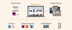
In a never-ending sea of RFP responses, a visually compelling proposal can set your AEC firm apart. However, managing and using the right graphics can be a challenge without the proper tools. With OpenAsset, a game-changing DAM for the built world, you can ensure your proposal graphics hit the mark every time.
With OpenAsset’s key features, the process of integrating compelling graphics into your proposals becomes streamlined and efficient. For example, with OpenAsset’s advanced tagging and metadata functionalities, locating the perfect graphic for your proposal becomes a breeze. No more wasted time searching through irrelevant files.
Additionally, OpenAsset’s integrations with various design and document software, allow you to directly pull and place assets into your proposals, ensuring brand consistency. You can also customize graphics to fit different sections of your proposal without compromising quality. OpenAsset’s automated tools ensure each image is optimized for its placement.
These are just a few of the benefits OpenAsset can bring to your AEC firm. If you want to learn more about the significant benefits a DAM like OpenAsset can bring to your company, get in touch with us.
Ready to make a powerful visual statement in your proposals? Schedule a demo now.