


How to write a proposal cover page + 6 examples
Aug 22, 2023

Last updated — November 06, 2025
According to OpenAsset’s 2024 research, 17% of teams report winning 30–39% of bids, while another 16% win 40–49% of their RFPs. These winning teams share one thing in common: they know how to make a powerful first impression. And that first impression often starts with your proposal cover page.
But how do you strike the right balance between professionalism and creativity? How do you ensure your cover page stands out in a sea of similar proposals? If these questions have crossed your mind, you’re in the right place.
In this blog, we’ll cover each element necessary to create an outstanding proposal cover page in the AEC industry. We’ll also provide you with six examples in the AEC examples and tell you why they work. By the end of this blog, you’ll be ready to elevate your proposal writing and leave a lasting mark on your reader.
The importance of proposal title pages
In the Architecture, Engineering, and Construction (AEC) industry, firms often compete for high-value contracts, and clients are looking for partners they can trust. Architecture proposal covers are a big role in both of these factors– making you stand out among the competition and building trust among potential clients.
It not only speaks to the professionalism and quality of your firm but also serves as a differentiator, setting you apart from competitors. Like the foundation of a building, a strong proposal title page supports the entire structure of your proposal, ensuring it stands firm among the competition.
The title page is often the first thing a client or reviewer will see when they open a proposal, and as with any first impression, it can set the tone for the entire proposal review process. Here’s why the proposal title page is so crucial in the AEC industry:
Making a lasting first impression
Just as the exterior of a building can draw you into its architecture and ambiance, a well-designed proposal title page grabs the attention of its reader. The proposal title page is a key tool in making a lasting impression. The first impression you make demonstrates your understanding of design, precision, and the client’s requirements.
Moreover, a well-organized and clear title page helps set the tone for the rest of the proposal, meaning that the document is professionally prepared and well-thought-out.
Showing your professionalism
The title page often includes critical details such as the project name, submission date, company logo, and contact information. A strategically designed title page indicates that you pay attention to detail, a quality highly valued in the AEC industry.
A professional title page also symbolizes your firm’s standards and the quality of work one can expect. If you can’t be bothered to make the cover look good, a client may question the diligence and care you will bring to their project.
Getting ahead of the competition
An impressive proposal title page can help you get ahead of the competition. For this reason, pay attention to factors that make your proposal cover stand out, such as branding and your value proposition.
The title page is an opportunity to showcase your company’s branding and identity. This differentiation helps clients quickly identify and remember your proposal amongst a pile of others.
Moreover, highlight your value proposition on the cover to subtly emphasize what makes your firm unique and why you are the best choice for the project.
How do you write a cover page for a proposal?
A cover page is a window to your proposal. It should be neat, organized, and able to demonstrate important information at a quick glance. Here’s a step-by-step guide on how to structure and include the relevant details on your proposal’s cover page:
1. The Name of Your Company
This aspect immediately identifies who is sending the proposal. Place this at the top or center of the page, preferably in a larger font. Select a font that’s easy to read and showcases your style. Additionally, use minimal colors and visuals to keep the attention on the name and title.
2. Logo and Graphic
The cover page should display high-quality logos and graphics that highlight your work to its fullest advantage. Go for sharp, well-illuminated images that resonate with your unique style and aesthetic.
Position your company logo strategically. It could be near the name of your company or at the top center of the page. If you have a relevant graphic or image that represents the project or your company’s ethos, consider integrating it into the design, but ensure it doesn’t clutter or overwhelm the page.
3. Project Title
The project title should be located centrally or just below your company name. This tells the recipient what the proposal is about. Make sure the title is specific and descriptive. It should capture the main goal, scope, and value of your project in a few words.
4. Date of submission
Typically placed at the bottom or top-right corner. This indicates the currency and relevance of the information presented. You might format it as: “Submission Date: August 21, 2023.”
5. Name of Client
This should be positioned either centrally, near the project title or in the top-left corner. This personalizes the proposal and makes it clear who it is intended for. For example, “Proposal Prepared for: [Client’s Name/Company]”
6. Contact Information
It’s essential to have your contact details on the front page, making it convenient for potential clients or employers to reach out to you. Include a dedicated section, often at the bottom, with the following details:
- Name
- Phone Number
- Email Address
- Website
Design elements for effective cover pages in 2025
Creating a proposal cover page that captivates in 2025 requires more than good looks—it must balance design innovation, brand clarity, and data-driven psychology. Here’s how to build one that resonates with both human and digital audiences.
Typography and font choices
Typography sets the tone of your brand. Choose professional, legible fonts that reflect your firm’s personality. Sans-serif fonts remain dominant for digital and print readability, but pairing them with subtle serif accents can help evoke sophistication. Consistency in font weights and spacing ensures visual harmony across every element.
Color schemes
Color psychology plays a growing role in how proposals are perceived. Stick with two to three brand-consistent colors. For AEC firms, neutral bases with one bold accent—like navy and gold or gray and teal—create a professional yet memorable look. Use color to highlight key elements (such as titles or client names) while maintaining balance and accessibility.
Use of logos and branding
A logo communicates brand identity faster than any paragraph could. Position it prominently but not overpoweringly. According to a February 2025 study, it takes only 10 seconds for people to form a first impression of a brand’s logo (DesignRush, 2025).
Ensure your logo is high-resolution, placed on a clean background, and aligned consistently across all client-facing materials. A clear, balanced placement helps convey professionalism and trust at a glance, while maintaining cohesion with the rest of your proposal’s design.
Layout and spacing
A well-structured layout enhances navigation and engagement. Keep margins generous and maintain hierarchy through headings, subheadings, and whitespace. It takes 2.6 seconds for eyes to settle on key areas of a page (Paradigm Marketing & Design, July 2025).
Use that knowledge strategically—direct attention toward your project title, logo, and main call to action. Balanced spacing, consistent alignment, and visual breathing room help readers process your information quickly and intuitively. A clean, well-paced layout reflects both aesthetic sensibility and technical precision, which are invaluable in AEC proposals.
Accessibility and responsiveness in proposal cover pages in 2025
Designing for screen and print
Optimize file settings so visuals remain crisp in both digital PDFs and printed copies. Use CMYK for print materials and RGB for digital formats. Ensure that resolution and bleed settings meet professional print standards without inflating file size.
Ensuring text and color contrast
Accessibility isn’t optional; it’s professional. Text and background colors should maintain sufficient contrast ratios (minimum 4.5:1 for body text). Content that includes color is 39% more memorable than content without color (Search Logistics, February 2025). Use this to your advantage while remaining compliant with WCAG guidelines.
Optimizing file size and formats
Clients and reviewers often open proposals on various devices. Keep your file under 10MB when possible, compress images smartly, and export in universal formats like PDF/X to maintain fidelity across systems.
Accessibility best practices (alt text, readability, fonts)
Include descriptive alt text for logos and images, maintain a minimum 12pt font size, and avoid excessive decorative text. Screen readers should be able to interpret the cover easily—meaning titles, subtitles, and company names must use accessible text layers, not embedded images.
Leveraging AI and technology to create smarter proposal cover pages
The future of proposal design is intelligent and adaptive. AI-driven tools now allow AEC firms to generate, customize, and personalize cover pages in minutes, all without compromising design integrity.
Using AI tools
Platforms like Shred.ai and AEC-centric DAMs like OpenAsset empower teams to streamline proposal creation. AI tools can automatically pull project data, logos, and client information from your DAM, ensuring brand consistency and saving countless hours of manual formatting.
Automating proposal details
AI integrations can auto-populate client names, project titles, submission dates, and contact details from proposal writing, CRM, or DAM platforms. This eliminates repetitive errors and ensures every proposal cover is accurate and up to date.
AI writing assistants for titles and taglines
Generative AI tools have quickly become a game-changer for AEC marketing teams, offering speed, creativity, and precision in crafting proposal titles and taglines that resonate with clients. According to OpenAsset’s 2025 AI & Innovation in AEC report, 57% of AEC firms already use AI for proposal writing, while another 27% are considering adopting it. This widespread adoption shows that AI writing assistants are no longer experimental; they’re now essential tools in competitive proposal creation.
These AI assistants can instantly analyze tone, industry terminology, and client focus areas to generate headlines that align with your firm’s voice and the project’s goals. For instance, tools like OpenAsset’s Shred.AI are used to refine proposal narratives, suggest phrasing that boosts clarity, and even generate alternative headlines for A/B testing. Marketers cited that these AI features “save hours—what used to take days can now be done in minutes,” allowing teams to focus on design and storytelling.
Beyond time savings, the strategic value is clear: 44% of surveyed AEC professionals believe AI will make the biggest impact in proposal writing and content creation, underscoring its growing role in how firms communicate their expertise.
Reviewing and refining with human oversight
While AI writing tools excel at generating options and analyzing readability, marketers should still review every output for tone, compliance, and brand consistency. The most effective teams blend automation and creativity: using AI to accelerate ideation, then applying expert judgment to ensure the message authentically represents the firm’s brand voice.
Title page tips for architecture, engineering, and construction proposals
In the AEC industry, every detail counts, from the beginning of a project to the end. A well-constructed title page can set the tone, show professionalism, and resonate with the values and expectations of your prospective clients. Here are some key tips to ensure your title page captures attention:
Have a catchy title
The title is, without a doubt, the most important part of a proposal title page. It directs the reader’s attention and sets the stage for what’s to follow. It is the first aspect that the reader will process, and it shapes their initial perception of the entire proposal.
A catchy title is like a magnet – it draws the reader in. It evokes curiosity, intrigue, and a desire to learn more. Craft your title in a way that it doesn’t just inform, but also persuades. Make a promise or hint at a unique approach. Instead of “New Building Proposal,” consider “Innovative Design Meets Sustainable Living.”
An engaging title is not just about being catchy; it also needs to be informative. It should provide a concise snapshot of your proposal’s core. Vague titles can lead to confusion, while overly detailed ones can overwhelm you. The balance lies in being succinct yet meaningful.
Wherever relevant, ensure your title gives a hint of the primary benefit or the unique value your proposal brings. If you’re presenting a sustainable architectural design, for instance, that’s not just a feature – it’s a significant benefit that can set your proposal apart.
Moreover, there are times when one line isn’t enough, and that’s okay. Using a subtitle allows you to add depth, provide clarity, or further pique interest. While the main title might capture attention with its bold assertion, the subtitle can deliver a more detailed promise or context.
Create an impactful design
The cover page, the first point of contact, should be designed to impress and inform. Choose colors that align with your brand and resonate with the proposal’s theme. Limiting to 2-3 primary colors can create a more cohesive and professional look. Colors evoke emotions and perceptions. For instance, blues might convey trust and stability, while greens can emphasize sustainability, so keep that in mind when creating your proposal cover page.
Moreover, ensure the title is prominently sized, with subtitles and other details progressively smaller but still legible. Prioritize “easy to read” fonts, especially for critical information. Clean, sans-serif fonts are often favored for their readability.
Make sure to position your company logo where it’s easily visible, typically at the top or center of the page, and use graphics that complement the proposal’s content.
Additionally, white space (or negative space) gives elements on the page room to breathe, enhancing readability and the overall aesthetic. While you want to convey key information, avoid filling every inch of the page. Strategically using white space can make your cover look more professional and organized.
Keep branding aligned
The cover page of a proposal presents an opportunity to assert and reinforce your company’s brand. Ensuring brand alignment on this critical page is essential. Brand consistency ensures that the reader instantly identifies the proposal’s source, enhancing the recall value of your company.
Familiarity breeds trust. When clients or partners recognize consistent branding, it instills a sense of reliability and professionalism in your services. Moreover, distinct and consistent branding helps your proposal stand out from a pile of generic documents, giving you a competitive edge.
The best way to ensure consistency across your brand is to implement a software solution, like Digital Asset Management (DAM) software, to manage the ever-growing number of images, videos, logos, and media you keep in your digital asset library.
Every company has brand assets that shape how people view and engage with the brand. Your assets collectively contribute to your brand, and ensuring their consistency and currency is the main focus of DAM solutions.
Don’t forget about proofreading
You must make sure your proposal cover page is perfect through diligent proofreading. In an industry with lots of competition, your brand’s reputation can be a differentiator. Errors, however minor, can tarnish your brand’s image and reduce the trust clients place in your capabilities.
The cover page is the very first thing a prospective client or partner sees. A single spelling error, grammar mistake, or misalignment can display a negative image, even before the proposal’s content is reviewed. Proofreading showcases diligence, care, and a commitment to excellence. A flawless cover page communicates that you apply the same meticulousness to your projects as you do to your winning proposals.
Beyond just errors in grammar or spelling, proofreading ensures that the proposal’s intent, objectives, and key details are clearly and effectively communicated. Ambiguities or inconsistencies might lead to misunderstandings or misinterpretations.
Lastly, an unchecked cover page might contain outdated logos, incorrect project titles, or misnamed client details. Such oversights can be embarrassing, unprofessional, and potentially cost you valuable contracts. As mentioned earlier, especially in a field like AEC, consistency is of high importance. Proofreading ensures that such information is consistent across the cover page and the entire proposal.
Common mistakes when creating proposal covers in 2025
Even the most skilled AEC marketers make design missteps. Here’s what to avoid:
- Overloading the cover with graphics that distract from core information.
- Using poor color contrast that’s unreadable on digital screens.
- Embedding oversized images that bloat PDF file size and slow downloads.
- Ignoring mobile responsiveness or neglecting print readability.
- Forgetting to update client or project names pulled from templates.
In 2025, clarity, speed, and brand consistency are key. Keep your cover light, accessible, and intentional.
6 proposal cover page examples
The heart of your proposal might be strong and compelling, but what about its face—the cover page? Now that we’ve gone into detail on each aspect that makes up a standout proposal cover page, let’s see what it looks like in action with six cover page examples across the AEC industry. These AEC title pages not only showcase diverse styles and approaches but also serve as a roadmap for creating your captivating cover.
Architecture proposal title page
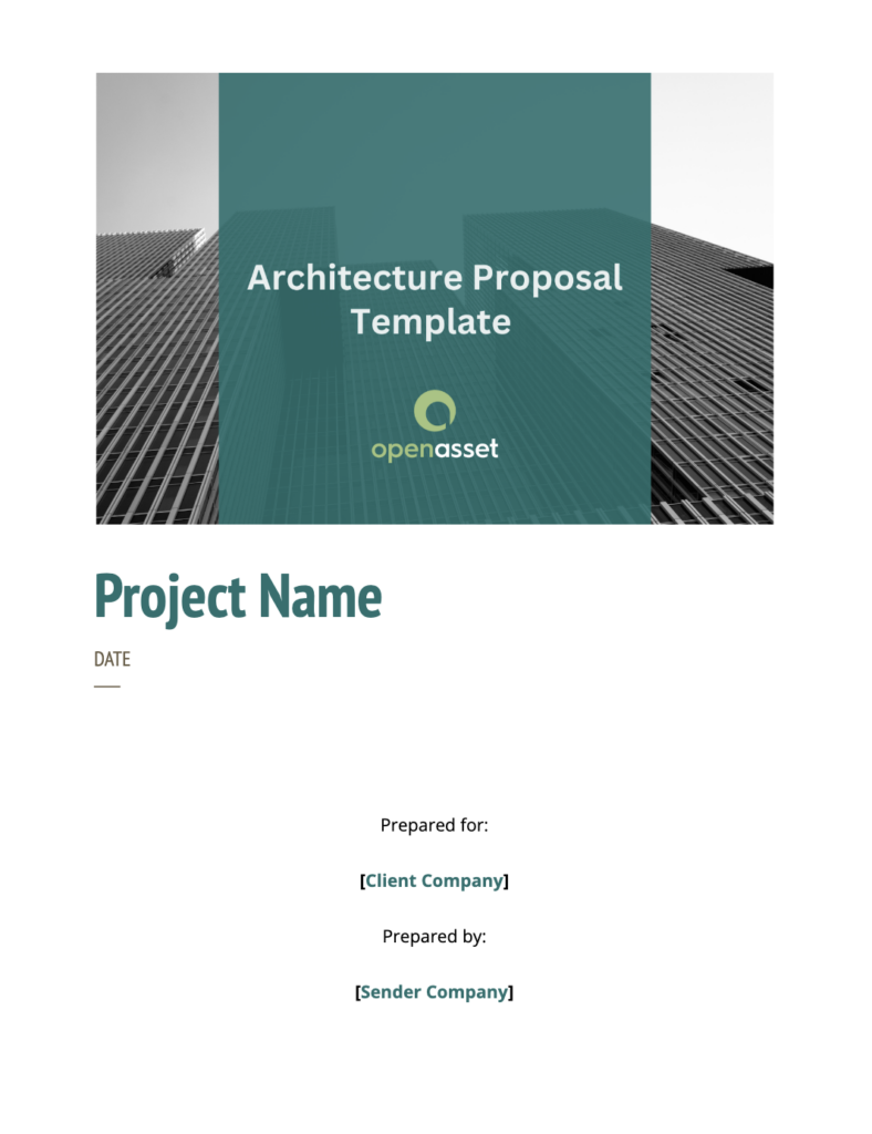
Why this architecture proposal cover page works:
- Great use of white space
- The logo is clearly visible
- Colors align with brand
- Submission date included
- The project name catches your attention and is located in the center of the page
- Includes information for the client company and the sender company

Source: Proposal Kit
Why this architecture proposal cover page works:
- Limiting to 2-3 primary colors
- Great use of images
- The logo is placed at the top, making it easily visible
- Includes proposal/submission date
- Includes information for the client company and sender company
Engineering Proposal Title Page Examples

Source: Template.net
Why this engineering proposal cover page works:
- Great use of color scheme (no more than 3 colors)
- Imagery isn’t overpowering
- The company logo and company name are placed at the top
- The title is front and center
- The font is easy to read
- Includes contact information
- Includes submission date

Source: SampleTemplates
Why this engineering proposal cover page works:
- Great color scheme
- Use of white space
- Includes contact information
- The logo and company name are located at the top
- The project title is eye-catching, located centrally
- Use of the three primary colors creates a professional look
Construction proposal cover sheet
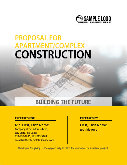
Source: Office Templates Online
Why this construction proposal cover page works:
- Effective color scheme
- Imagery isn’t overpowering
- The logo is placed at the top
- The title is big, centered, and easy to read
- Use of tagline and subtitles
- Contact information included

Why this construction proposal cover page works:
- The project title is located in the center
- Proper use of images in the background
- Easy-to-read font
- 2 primary colors are used for a professional look
- Contact information included
- Submission date included
- The company logo is visible
- Easy-to-read font
DIY proposal cover pages: building your own from scratch
If you’re not using pre-built templates or design tools, creating your proposal cover page manually can still be highly effective. Start with a clear grid layout, consistent margins, and a defined visual hierarchy. Use Canva, Adobe Express, or InDesign for lightweight design control. Keep editable versions of your cover pages in your DAM or shared drive for easy updates and consistency.
How to have the perfect title page for every proposal
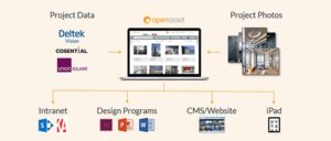
To win clients and secure projects for your AEC firm, it’s essential to create compelling proposals, starting with the title page. However, we recognize the obstacles you may encounter in this process. That’s why, unlike traditional DAM systems, OpenAsset offers a project-based DAM solution specifically designed for AEC marketers.
Our platform enables you to create documents in seconds with templates and generate high-quality RFP responses efficiently and effortlessly. With a wide range of integrations and valuable features, OpenAsset serves as the ideal marketing technology solution for creating persuasive content, proposals, presentations, and more.
If you’d like to learn more about our DAM technology, you can reach out to our Support team here or contact one of our digital asset experts today to schedule a demo.