

Best architecture presentation board ideas

Jul 7, 2023
10 min

Last updated: April 02, 2026
If you’re an architect, you know that one of the most impactful methods for expressing your ideas is to create an architecture presentation board. These boards don’t just showcase the technical details of your project, but narrate the story and concept of your design.
However, creating an architecture presentation board can prove challenging. It’s crucial to establish a well-designed layout that maintains a cohesive and engaging narrative. In 2026, it’s also crucial to integrate technology like AI, real-time rendering, and cloud-based tools to improve efficiency and meet modern design and formatting expectations. This will enable you to effectively communicate your ideas and elevate the impact of your architecture proposal.
This blog will explore ten elements of a good architecture presentation board that are necessary for crafting a polished and visually captivating presentation, such as layout, structure, color, and more. It will also cover how to implement technology to streamline your workflow and deliver an architecture presentation board in digital formats.
By the end of this blog, you’ll possess the knowledge and confidence necessary to produce a creative and impactful architecture presentation board. This will allow you to showcase your architecture projects accurately and secure new projects.
Key Takeaways: Architecture presentation boards (2026 update)
- Purpose: A presentation board visually communicates a project’s concept, context, and design intent in a clear, persuasive format.
- Core elements: Effective boards balance layout, visual hierarchy, colors, fonts, imagery, and concise text to guide attention and tell a cohesive story.
- AI integration: AI is now essential to helping teams iterate faster, but firms are slow to adopt it. 44% of designers now use AI for concept images, 32% for photorealistic enhancements, and 26% for image upscaling.
- Visualization trends: Real-time rendering demand is rising, but only 26% of firms deliver animated or interactive boards frequently.
- Workflow shifts: 52% of visualization professionals work in hybrid setups, driving adoption of cloud-based and GPU-accelerated tools for faster rendering and collaboration.
Table of contents
What is an architecture presentation board?
10 architecture presentation board ideas
- 1. Size and orientation
- 2. Layout
- 3. Structure
- 4. Background
- 5. Colors
- 6. Visual hierarchy
- 7. Image selection
- 8. Content
- 9. Text
- 10. Font
Using AI and technology to create architecture presentation boards
- Incorporating real-time and interactive presentation tools
- Streamlining collaboration with cloud-based platforms
- Using AI for concept generation and iteration
- Enhancing visual quality with AI rendering and post-processing tools
How to choose the right elements for your architecture presentation board
- Define your core message
- Consider the client’s needs
- Prioritize elements that support the narrative
- Strategically balance visuals and texts
- Create a clear hierarchy of information
- Adapt elements for digital and interactive formats
- Maintain consistency across all elements
Next steps: Improving your architecture presentation board workflow with DAM software
FAQs: Answers to top questions about architecture presentation boards
- What is an architecture presentation board?
- How do you make a good architectural presentation board in 2026?
- What elements should be included in an architecture presentation board?
- How can I effectively convey my design concept through a presentation board?
- What software tools are recommended for creating architecture presentation boards in 2026?
- How do I balance text and visuals on my architecture presentation board?
- What tips can help make my architecture presentation board more visually appealing?
What is an architecture presentation board?
Applying all of this information to your architecture presentation board may seem challenging, but with the help of a well-designed layout, you can effortlessly tackle this task.
An architecture presentation board is a visually appealing graphic that effectively summarizes all the ideas of your project. It provides a condensed and clear representation of your design. Architects use architecture presentation boards to showcase their projects and work.
The purpose of a presentation board is to construct a narrative that effectively conveys the essential information of your project in a self-explanatory manner. This enables readers to comprehend each of the proposed solutions with ease.
An architecture presentation board fulfills multiple objectives, including:
- Serving as a tool for presenting designs to clients, superiors, or colleagues
- Assisting in attracting clients and securing commissions
- Contributing to the advancement of your career and elevating your architectural projects to new heights
Architecture presentation boards serve various purposes, being used by both students and professionals. During your time as a student, these presentations are crafted for juries and submissions, allowing you to present your work to professors and peers. In your professional life as an architect, these boards are used to present designs to clients, committees, shareholders, and exhibitions.
In many ways, an architecture presentation board resembles a sales pitch, as you are essentially promoting your design, ideas, and concept to win clients over.
10 architecture presentation board ideas
While the architecture presentation board may not be the only aspect of the project itself, it certainly has an impact on the audience. Additionally, it can showcase your artistic abilities and design skills.
The structure of an architecture presentation board serves as the platform for combining the key ideas of your project, presenting only the essential elements required for a clear understanding of the proposed concept. Remember, there is no need to incorporate every single detail into the presentation board. It is equally important to be careful with the amount of text used and to maintain focus on the central idea of the project.
To help you get started, let’s take a look at some of the essential concepts (with examples) that must be considered when creating your architecture presentation board. This will help you create a flawless presentation board for clients.
1. Size and orientation
When designing your architecture presentation board, you will have to determine whether you will be presenting them in landscape or portrait orientation. You can explore different formats to enhance the presentation of your proposal.
However, it’s not certain you’ll get to choose the size or orientation of your presentation boards. You’ll most likely encounter limitations that restrict you to a particular board size and a specific number of boards. Sometimes you will have the opportunity to choose the size and orientation of your presentation boards. However, more often than not, these decisions will be decided by your director, client, or professor. It’s important to ensure that you are aware of the parameters beforehand to avoid any inconsistencies.
If you’re a student, it is common for professors to impose restrictions regarding board sizes and the number of boards. In such cases, you should verify whether your boards should be presented in landscape or portrait orientation.
However, if you have been allowed to decide for yourself, take some time to think about it. Consider which orientation will make your graphics stand out the most and which one will best tell the story of your project.
Apart from deciding whether your board will be in the landscape or portrait orientation, you will have to decide which way you will present your board. Some options include:
- Side by side as a single large board
- As one equivalent-sized poster
- As separate boards arranged in a sequence
Keep in mind, the orientation and size of your boards can also have an impact on the structure and layout of your presentation.
2. Layout
When arranging your architecture presentation board, think about the main ideas you want to express. Then, decide on the images and graphics that will best showcase those concepts. Collect all the required information and take note of the graphics and text that will best convey your concepts effectively.
Before starting the actual layout of your boards, take time to sketch out different versions to identify the most suitable arrangement. Create small-scale sketches to capture the basic flow of each board, enabling you to experiment with different element placements before finalizing your design on the boards themselves. This process allows for flexibility and adjustments to ensure you achieve a complete overview of your ideal layout.
Once you have decided on the layout you want, think about how much space each element will require on the page. Make sure each graphic is big enough to make an impact and consider the amount of space you want to leave between each graphic. Leave enough space so that it doesn’t look crowded or messy, but, avoid leaving too much space as well, as it may give the wrong impression.
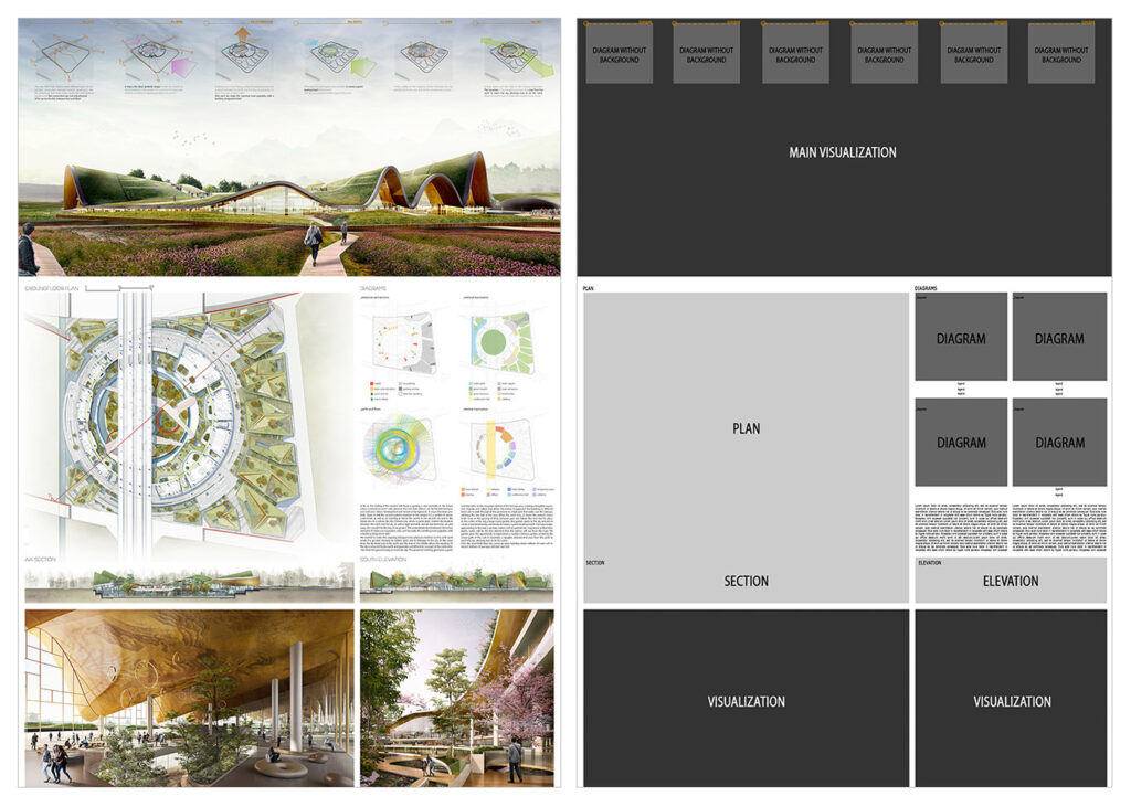
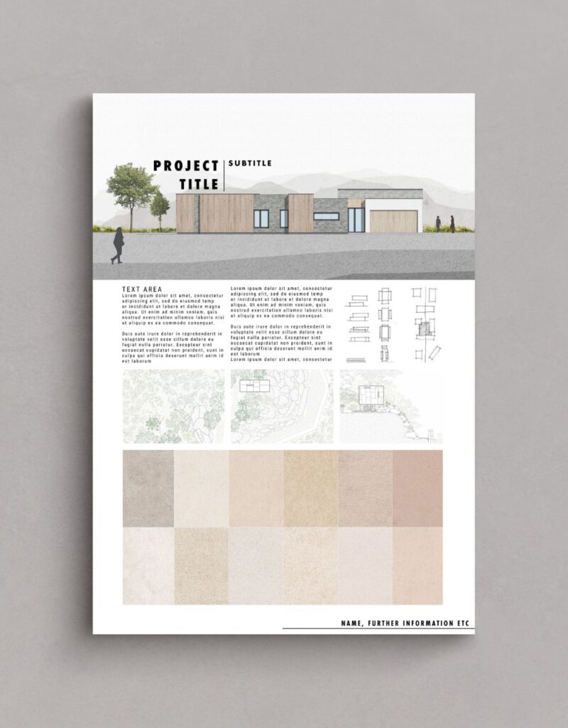
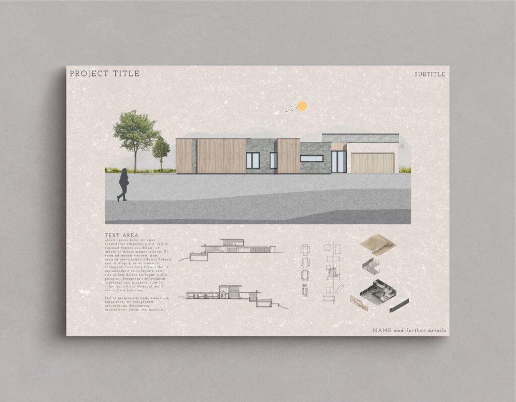
3. Structure
Using a grid structure is the most common layout method used among architects because it simplifies the organization of visual elements in your presentation. Several compositions can be used when using a grid structure, such as square or rectangular grids, mixing texts, and images, or even adopting an organic structure.
The grid serves as the fundamental framework for diagramming. Diagramming an architectural presentation board involves the organization and arrangement of graphic and textual elements that deliver comprehensive information about your project. This process ensures a well-structured and cohesive representation of your proposal, providing viewers with an accurate representation of your architectural vision.
Keep in mind, you are essentially narrating a story, therefore you must carefully consider the flow of the narrative as you organize your presentation board. To help you get started, follow these steps:
- Consider the perspective of the individual observing your presentation
- Prioritize what you want them to see first
- Strategize the most effective approach to displaying your project’s story to them
- Evaluate if your structure and layout successfully achieve this objective
Remember, normally, we read presentations from left to right and from top to bottom, so consider the story of your project and how it will be read.
You should also consider how each board in your presentation relates to each other. Assess whether there is a logical progression from one board to the next, ensuring that the sequence flows seamlessly. In case you will not display all the boards simultaneously, consider numbering them to guide your viewers and ensure they follow the correct sequence.

4. Background
The background of your architecture presentation board should not be complex or cause difficulty. We want the viewer to easily see all the elements without any distractions from a busy background. It’s important to avoid anything that may draw attention away from the crucial details of the board. Let your graphics and text take center stage, refraining from using bold colors or textures that may take away the focus from them.
With that being said, be very careful when choosing a black background. It may diminish the readability of text and potentially reduce the impact of your graphics. Moreover, background images, if chosen, can often be distracting. A black background could also set a cold and boring tone. Therefore, if you opt for this approach, make sure that all the information remains easily comprehensible.
On the other hand, going for a white or light gray background will enhance the visibility of your graphics and text, allowing them to stand out effectively. This choice gives your presentation a professional appearance without overwhelming the viewer. While you can incorporate other colors that align with your central concept, ensure that the background remains plain enough for the viewer’s attention to be primarily directed towards the design rather than the background itself.
Regardless of the color you select for your background, use it strategically to your benefit. Embrace the concept of negative space and leverage its power. Include only essential information in your presentation, resisting the temptation to fill empty spaces with irrelevant details. The skillful use of negative space enhances the impact of your design, creating a clean and professional feel.
5. Colors
While we discussed the use of the typical black, white, and gray colors in an architecture presentation board, don’t hesitate to include some colors. However, be mindful of your color choices to strike the right balance, ensuring that your board doesn’t appear dull or overwhelming. Introducing hints of color can bring life to your presentation boards and draw attention to the elements you want to highlight. This will help guide your viewers’ focus to the key aspects of your presentation board.
How you can use colors to make your design more lively? One example is you can add a contrasting color like green for landscaping to a mostly single-color presentation. You can also use a different color to represent specific building materials, such as brick, glass, or wood. These color choices bring visual appeal and improve the overall look of your design.
You can also consider opting for a bold and attention-grabbing color, such as pink or red, to serve as a prominent feature in your diagrams. If you aren’t feeling inspired, there are many pre-made color palettes available online for you to work with.
The choice is yours and whichever color you decide to continue with, make sure to always ensure consistency by using the same color across all of your boards. This approach will help maintain a cohesive and seamless flow throughout your presentation.
6. Visual hierarchy
When creating your architecture presentation board, leverage visual hierarchy to highlight specific images on your presentation boards. This means you should select which image deserves the most visual attention within the hierarchy. Identify your project’s strongest point that you want to highlight, and make it the main focus that catches the viewer’s eye from far away. You should also incorporate other images that reveal their details when viewed up close.
So, how can you do this effectively? There are various techniques to draw attention to a specific drawing, such as playing with color or size. Don’t be afraid to use up the space you need to display the images that are crucial for your vision. For example, you can make the image you wish to highlight the largest, ensuring it can be viewed clearly from a distance of 6ft. This effectively communicates the visual hierarchy and emphasizes the importance of the highlighted image.
Another method is to use color to direct the viewer’s attention to a specific graphic. By using color in a targeted manner, you can effectively guide the viewer’s eye toward the main idea on the board.
You also have the option to center the image you want to highlight and arrange the surrounding content to complement it. This technique is particularly effective when the image contains elements that serve as the background of the architecture presentation board, such as a large sky or landscape.
For the best outcome, focus on keeping the overall vision of your project in mind and selecting images that directly display and strongly support that idea.
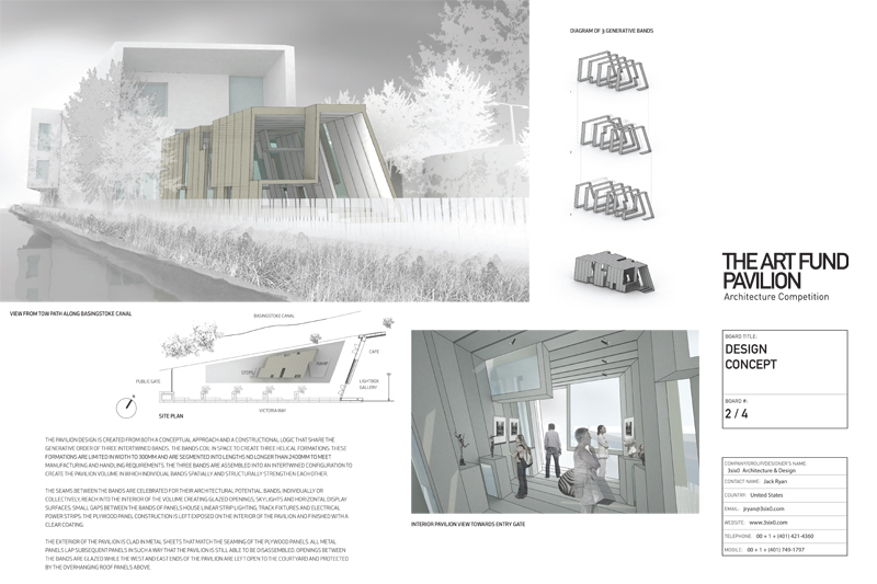
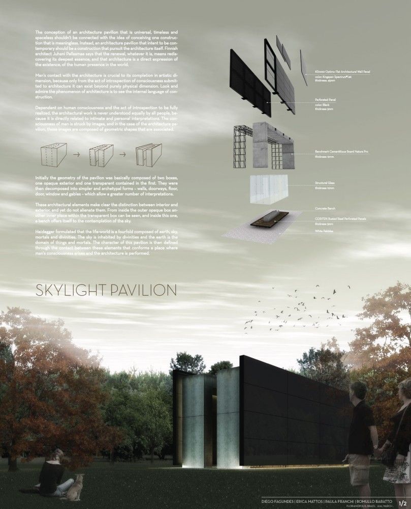
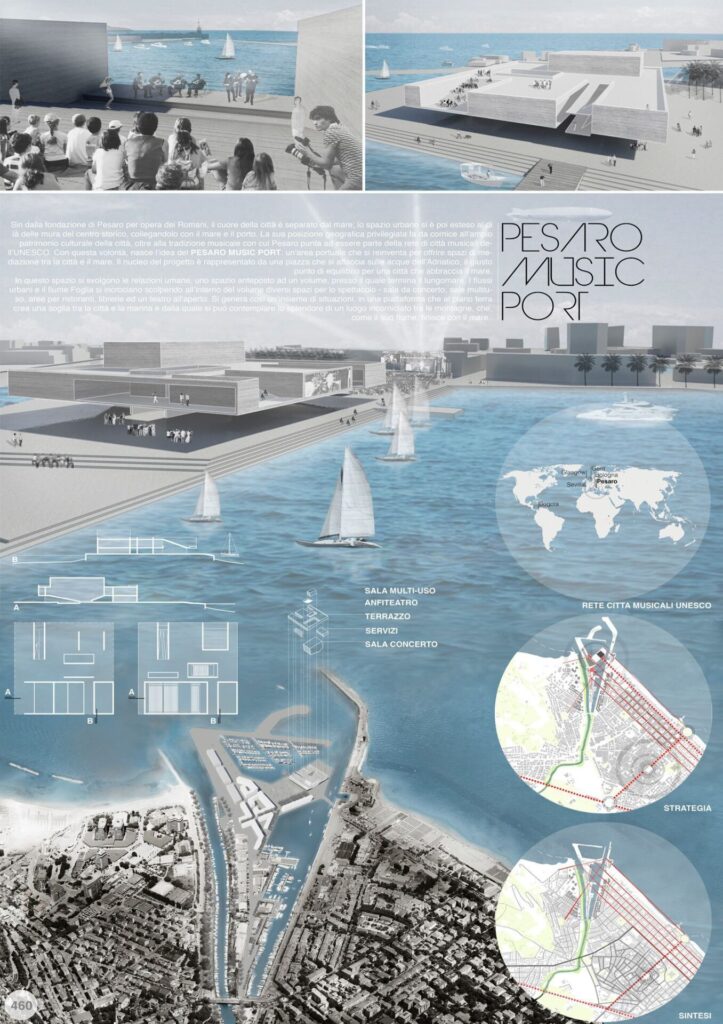
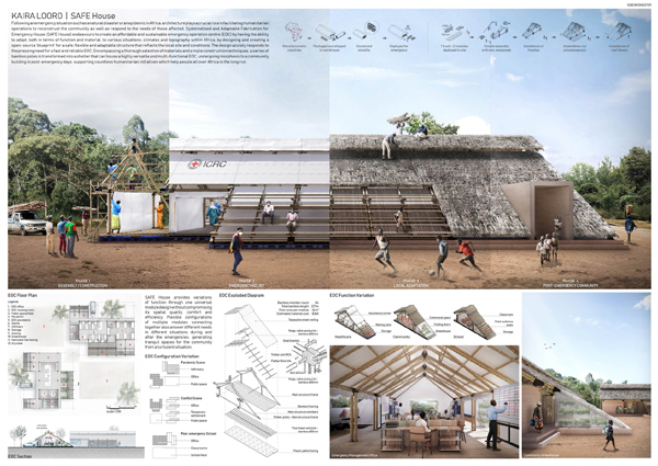
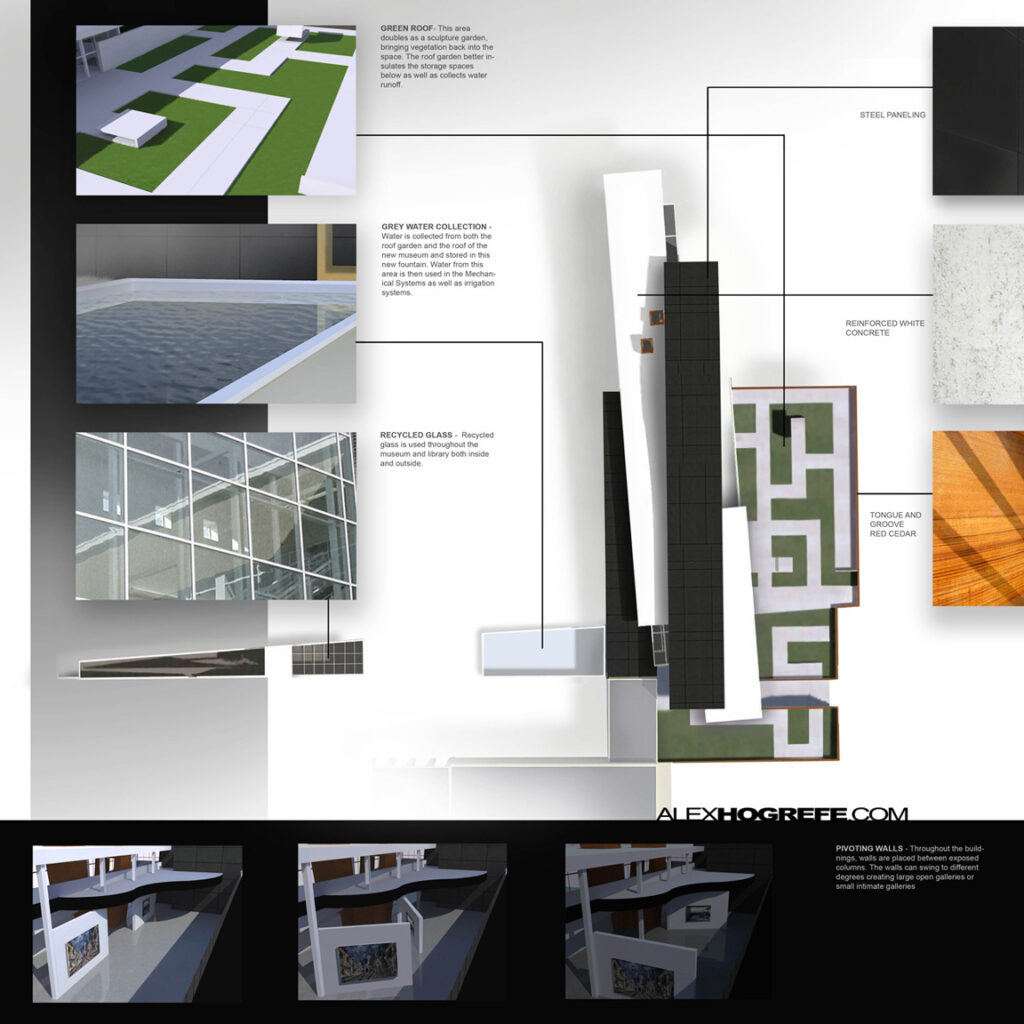
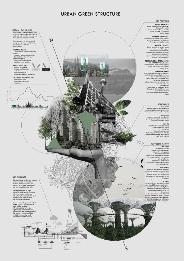
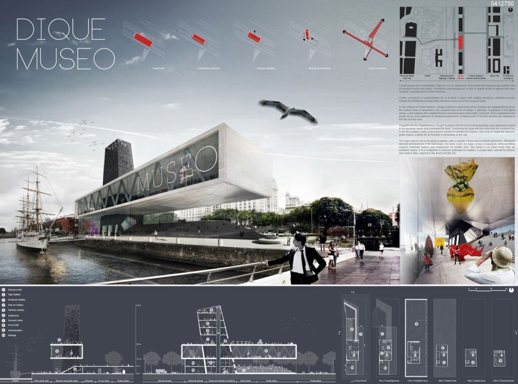
7. Image selection
Choosing the right images is an important aspect of creating your architecture presentation board. The graphics you select can either make or break your entire presentation board. Throughout the architectural design process, you will generate various sketches, models, renderings, and drawings. Make sure to carefully select the images that effectively communicate the important details of your project.
Keep in mind, using an excessive number of images in your presentation can lead to a cluttered and confusing visual experience for the viewer. However, using enough images may give the impression that you needed to invest more effort into your presentation. Strive for a balanced representation that showcases your project effectively.
8. Content
Not only should your architecture presentation board be easy to understand but it should also demonstrate your full commitment and dedication to your project.
When it comes to planning out the content for your presentation board, consider the following elements to ensure a clear understanding:
- Internal and external images
- Isometric views and exploded views
- Perspective cut
- Diagrams
- Volumetry studies
- Descriptive memorial
- Technical drawings (plans, cuts, and details)
It’s important to note that not all the mentioned items need to be included in every project, as this depends on the specific requirements and nature of each project. However, these elements are valuable resources that can enhance the understanding of your architecture proposal whenever applicable.
9. Text
It’s important to keep text at a minimum on your architecture presentation board. You should write a concise and focused concept statement, avoiding wasting time on lengthy descriptive text that is unlikely to be read. Shoot for a clear and short message that effectively communicates your concept.
Some questions to consider when organizing the text sections in your architecture presentation board include:
- What is easier to read?
- What flows best?
- What is pleasing to the eye?
Moreover, when creating the text for your architecture presentation board, consider the alignment of your text within its designated text box. Think about which alignment is easier to read and pay attention to text spacing and hyphenation to ensure they appear visually pleasing on your presentation board. Don’t forget that the size and alignment of your text boxes should complement your graphics. They are important elements of the visual hierarchy in your presentation.
Some tips to consider when creating the text for your architecture presentation board:
- Do not use all capitals in your text, unless it’s for the title
- Follow the standard rules of capitalization for a professional and easy-to-read presentation board
- When possible, replace text with simple illustrative sketches and figures
Remember, your presentation serves as your sales pitch. Therefore, avoid lengthy explanations that would cause you to lose your audience’s attention and keep your message concise and engaging to effectively capture and maintain their interest.
10. Font
Select an appropriate font for your title and text, using only one font type per project whenever possible. However, you can create variations by adjusting the font size for the title, concept statement, and labeling. Consider using Sans Serif fonts such as Futura or Helvetica, as their sleek and minimalistic style complements modern high-tech designs.
When choosing a font for your architecture presentation board, consider the following:
- Avoid script or handwriting fonts to achieve a clean and professional look
- Keep the color of your font dark (ex. black or dark gray) to provide contrast to a light background
- Choose a font and size that will be easy to read
- Make sure the title font and placement are consistent from board to board
- Use font sizes to create a hierarchy (e.g. a large font for titles, a slightly smaller font for subtitles, and a standard size for the rest of the content.)
The font you choose for your architecture presentation board can significantly impact its success or failure and greatly influence its level of engagement, which is why it’s important to make sure you find the best architecture font.
Using AI and technology to create architecture presentation boards
AI and other emerging technologies like real-time rendering and animations are increasingly serving a role in creating architecture presentation boards. Clients now expect architecture presentation boards to serve as dynamic, data-informed storytelling tools with interactive elements rather than static assets. As architecture firms face tighter timelines and increased competition, AI-driven interactive boards are becoming vital to improving speed, visual quality, and client engagement.
Despite this growing trend, many architecture firms are slow to adapt. As Allie K. Miller, keynote speaker at the 2025 Conference of Architecture and Design said:
“We are not at the beginning of the AI age… we are actually in Act Two, and it feels like most companies are still improvising Act One.”
– Allie K. Miller, AI expert and keynote speaker at AIA25, June 2025
According to a 2025 report of artificial intelligence use in the architecture business, only 6% of architects regularly use AI tools in their daily work. 8% of firms have fully implemented AI solutions into their workflows, while 20% have plans to implement it. The statistics are slightly better for designers: a 2025 survey on AI use in architectural visualization says 44% of designers use AI to generate concept images, and 35% use it to create design variations. However, only 11% of firms use AI in their visualization pipelines.
But it’s not just AI. According to the same report, animated and real-time content using motion-rich boards or VR is rising in demand, but only 26% of firms report creating such content reguarly.
These relatively low usage rates signal a massive opportunity for firms to differentiate themselves from the competition. Here’s some tips, tools, and ideas for how to use AI and technology to create more captivating, modern architecture presentation boards.
Incorporating real-time and interactive presentation tools
Interactive elements, 3D rendering, and even VR (virtual reality) are becoming a major differentiator for architecture firms. Instead of relying solely on static architecture presentation boards, architects can integrate tools like Twinmotion, Unreal Engine, Envision, and Sketchfab to create dynamic features like:
- Real-time walkthroughs and animations
- Shareable 3D models via links or QR codes
- Immersive presentations that go beyond the board
With low adoption across firms, using these tools can help your presentation stand out in competitive pitches.
Streamlining collaboration with cloud-based platforms
Modern board creation is highly collaborative, and increasingly takes place in remote environments. This introduces challenges like slow render times and difficulty storing and organizing assets in a place that’s accessible for every collaborator. One 2025 report says that 52% of visualization pros now work in a hybrid environment, while 43% cite slow render times as a top pain point.
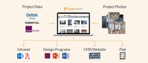
Fortunately, cloud-based tools make it easier for distributed teams to work together. Architecture-specific digital asset management tools like OpenAsset ensure all your assets live in one accessible place, while tools like Miro and Figma offer cloud-based collaboration and workflow management.
Benefits include:
- Simultaneous editing and feedback
- Centralized image and asset libraries
- Easier version control across teams
Using AI for concept generation and iteration
AI-powered tools can aid early-stage design visualization by allowing architects to generate and test ideas quickly. Instead of spending hours on manual processes, tools like Midjourney, DALL·E, and Stable Diffusion can help you:
- Create concept imagery
- Explore variations and test different design directions
- Rapidly iterate on massing, materials, and contexts
- Visualize abstract ideas before committing to detailed models
Enhancing visual quality with AI rendering and post-processing tools
AI can also be used to edit existing traditionally-created visual assets to improve final presentation quality. Many rendering and visual editing tools such as Lumion, Enscape, and Adobe Photoshop now have AI-enabled features that help you create visualizations more easily and further refine images. These features can help you:
- Enhance lighting, textures, and realism
- Upscale images for high-resolution boards
- Edit or extend visuals without re-rendering
This reduces reliance on time-intensive rendering workflows while still delivering polished, client-ready boards.
How to choose the right elements for your architecture presentation board
Unless specific instructions are provided to you when creating your architecture presentation board, the choice of elements to include will be up to you. It is important to balance creative expression with client expectations, coherence, and an effective, thorough explanation of your design. Here are some things to think about when choosing how to structure and format your architecture presentation board.
Define your core message
Before choosing visuals or layouts, clarify the single most important idea you want your audience to understand. Whether it’s a sustainability concept, spatial experience, or structural innovation, your board should revolve around that central narrative.
Consider the client’s needs
Different audiences will prioritize different aspects of a project, so your element selection should reflect their goals, level of expertise, and decision-making criteria. For example, some clients may prioritize cost-efficiency and ROI, while others may expect more conceptual depth and visuals. Tailor your board by:
- Highlighting the elements that matter most to your specific audience
- Adjusting the level of technical detail vs. visual storytelling
- Including diagrams or annotations that clarify complex ideas
Prioritize elements that support the narrative
Including every single drawing or rendering leads to overcrowding that dilutes your message. Select only the elements that actively help explain your concept. Strong supporting elements might include:
- Key plans, sections, and diagrams
- One or two high-impact renderings
- Concept diagrams or process sketches
Strategically balance visuals and texts
Architecture presentation boards are primarily visual, but text still plays a supporting role. The goal is to enhance understanding without overwhelming the viewer. Try to:
- Use short concept statements instead of long paragraphs
- Label drawings clearly and consistently
- Replace text with diagrams wherever possible
Create a clear hierarchy of information
A well-structured visual hierarchy ensures your board is easy to understand at different levels of engagement. Your elements should guide the viewer’s eye naturally across the board so that the basic concept is understood whether the viewer is skimming vs. analyzing in depth or viewing from up close vs. a distance. To establish hierarchy:
- Feature one dominant image or focal point
- Use size, contrast, and placement to emphasize importance
- Group related elements together
Adapt elements for digital and interactive formats
In 2026, presentation boards are often viewed on screens more than they’re viewed printed. It’s important to choose flexible elements that can perform well in presentations, PDFs, virtual reviews, and, of course, traditional print. Consider including:
- QR codes linking to 3D models or walkthroughs
- Simplified diagrams that read well on smaller screens
- Visuals optimized for both print and digital clarity
Maintain consistency across all elements
Consistency is what ties your board together into a cohesive whole. Disjointed styles can confuse viewers and weaken your presentation. Ensure consistency in:
- Color palette and graphic style
- Font usage and text formatting
- Line weights and diagram styles
Next steps: Improving your architecture presentation board workflow with DAM software
We hope this guide on the best architecture presentation board ideas was helpful. As you begin creating your architecture presentation board, remember that there are many technologies and platforms out there that can help you make more effective boards faster.
If you’re struggling with collaboration and asset organization in a hybrid environment, OpenAsset provides a solution. As the only Digital Asset Management (DAM) solution designed specifically for firms in the built world, OpenAsset makes it easy to find assets you may use in creating architecture presentation boards by project or person using keywords or file type. Our secure platform also helps you protect your digital assets by keeping them safe from unauthorized access and accidental deletion. You can also easily share files with team members, clients, and partners using controlled access to files.
To ensure consistency and manage your ever-growing number of digital assets, request a demo with us and learn how OpenAsset can help you manage your digital assets today.
FAQs: Answers to top questions about architecture presentation boards
What is an architecture presentation board?
An architecture presentation board is a visual summary of an architectural project that communicates its concept, design intent, and key details. It combines drawings, images, and minimal text to tell a clear and compelling story.
How do you make a good architectural presentation board in 2026?
Focus on clear storytelling, strong visual hierarchy, and concise content, while incorporating digital aspects like animations, digital renders, and VR walkthroughs. Utilize AI to boost efficiency, iterate on ideas quickly, and touch-up visuals. Use cloud-based tools to streamline collaboration and organize assets. A successful board balances design quality with efficiency and adaptability for both print and digital formats.
What elements should be included in an architecture presentation board?
Common elements include renderings, diagrams, text descriptions, images, a short concept statement. Design elements like branded colors, backgrounds, and visual hierarchy should also be included. The exact mix depends on the project, but every element should support the overall narrative and help the viewer quickly understand the design.
How can I effectively convey my design concept through a presentation board?
Prioritize one central idea and use visuals to reinforce it, supported by minimal text. Clear diagrams, strong focal images, and a logical layout help guide the viewer through your design story.
What software tools are recommended for creating architecture presentation boards in 2026?
For including interactive elements, animations, and renderings, use Twinmotion, Unreal Engine, Envision, or Sketchfab. For digital asset management, use OpenAsset, and for workflow collaboration, use Miro or Figma. To easily generate concepts and iterate on ideas, use AI tools like Midjourney, DALL·E, and Stable Diffusion. Finally, for rendering and post-processing, use Lumion, Enscape, or Adobe Photoshop.
How do I balance text and visuals on my architecture presentation board?
Keep text minimal and focused. Use it to support rather than replace visuals. Aim for a layout where images do most of the communication, with short labels or statements providing clarity.
What tips can help make my architecture presentation board more visually appealing?
Use consistent colors and fonts, maintain strong visual hierarchy, and avoid clutter. Highlight one key image and ensure all elements work together to create a clean, cohesive design.
Related posts
- How to create a winning presentation slide deck
- AI in architecture: benefits, use cases, and examples
- How to develop winning architecture proposals
- 19 architecture industry trends: Technology, design, and more
- Understanding the AEC industry + Top 17 AEC trends for 2025
- Free architecture proposal template: Win more work
- 10 tips for writing a compelling architecture proposal
Landon Iannamico is a content marketing expert with 6 years of experience helping B2B SaaS brands tell their stories and establish their verbal identities. He specializes in crafting brand narratives and producing content that breaks down complex concepts for highly specific, knowledgeable audiences across the data, AI, and engineering industries.