94% of people believe their first impression of a company is design-related. However, almost 40% of companies struggle to consistently create aesthetically engaging content.
In part two of our ‘how-to guide’ for creating great presentation content, we’re looking at how a little graphic design knowledge can help you create better-looking presentations. By creating winning presentation slides, you can leave a positive impact and win more business.
Why Graphic Design Matters
“It doesn’t matter how it looks, just make sure it includes everything.” It’s not uncommon for presenters to feel like squeezing all of their content into a presentation is more important than how it looks.
However, it’s equally important to get both the content and the visuals right. In fact, the brain processes images 60,000 times quicker than it does text. And it’s more accustomed to processing images—90% of the information sent to the brain is visual. Nearly 93% of all human communication is visual, so it’s hardly surprising that people tend to favor visual content over text alone.
A well-crafted presentation design can act as this visual cue for all the details you’re presenting, so the impact of visuals should not be overlooked.
Here’s why you should pay attention to the graphic design of your presentation slides:
- Inharmonious content is confusing and will make your message hard to understand
- A messy layout and poor color choices are distracting and will make your presentation difficult to look at
- Too many words and too little visuals make a presentation look dull and uninteresting
By showcasing information through visually appealing methods, businesses can enhance understanding and memory retention, thereby increasing the chances that the information will be recalled and shared.
Fortunately, you don’t need to be a professional graphic designer to start creating better presentation content. A little design thinking and an extra 20 minutes of looking at your slides will go a long way.
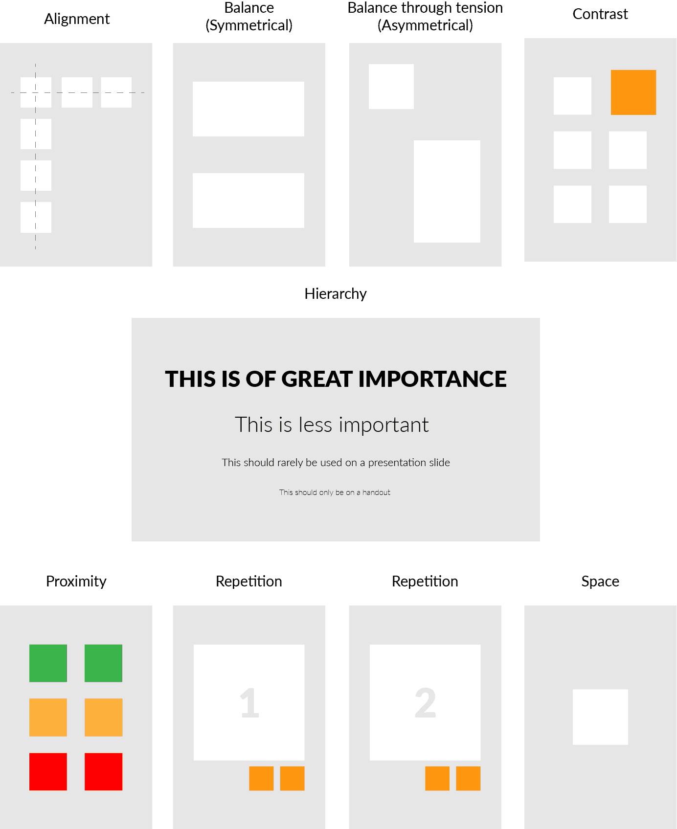
Graphic Design Principles
Graphic designers never design anything without thinking about what is on the page. Design, layout, and content quality are symbiotic. Here are the universal design principles that every graphic designer learns:
- Alignment
- Balance
- Contrast
- Hierarchy
- Proximity
- Repetition
- Space
In short, each is a guide to how elements of a design work together for the highest impact. Let’s take a look at each element to fully understand the meaning of each.
Alignment
Alignment is about making things look neat and tidy. Tidying up the alignment in your presentation may be the quickest way to make an impact on presentation visuals.
Think of it like this— it’s the difference between planting flowers in a flower bed, or planting them in totally random spots around your garden; what looks better?
All presentation applications have alignment tools that will do the work for you, making it a really simple win.
Balance
Do your presentation slides feel uneven or misaligned? Balance is about stability and elements fitting in place in a design. That can mean either symmetrical or asymmetrical.
Contrast
Contrast means organizing elements, drawing attention, and adding emphasis by playing one element against another through juxtaposition. This can be done by using size, shape, color, style, weight, etc.
Hierarchy
Not everything is important— some things require greater attention than others. Introducing a distinct hierarchy lets the audience know what’s most important in your message. This can be done with heavier type weights, size, position on the page, etc.
Proximity
proximity means organizing content in a way that creates a relationship between items with a common theme.
Repetition
With repetition comes consistency, and consistency helps you build familiarity. Examples of repetition include repeated graphics, referring back to a single idea, ensuring all images are of a similar style, or placing elements in the same spot on every slide.
Space
As discussed in part one of this series, space gives content room to breathe and helps your audience to focus on a single topic, idea, or point.
How to Apply Graphic Design Principles
So these graphic design principles can seem overwhelming. After all, graphic designers spend years learning how to best use the principles in their work. However, taking just one or two of these concepts and applying them to your content can make a great difference.
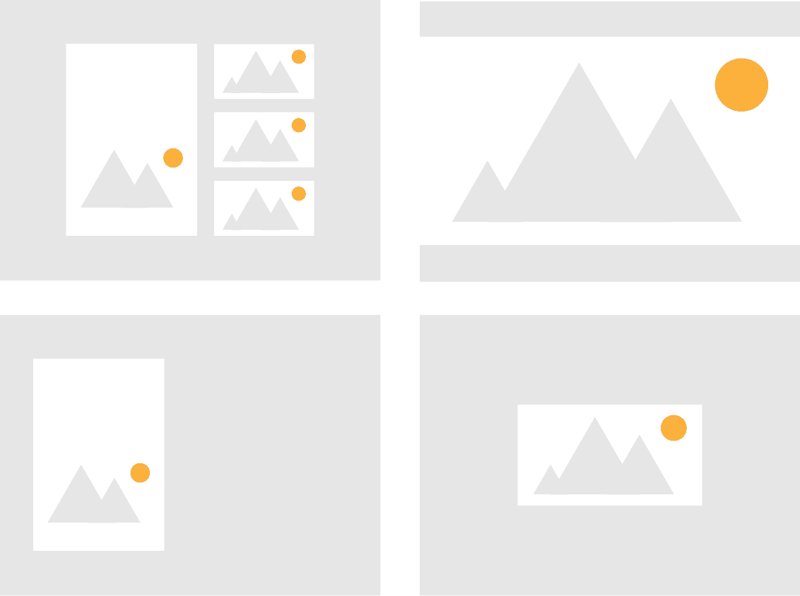
For example, let’s say you have a picture, three graphics, and a short text heading you want to include on a slide. A neat and simple way to present the content could be:
- Balance: Place assets symmetrically on the page
- Alignment: Align edges and space assets evenly
- Space: Center on the slide to provide focus
In just a few clicks you’ve effortlessly applied three design principles, as seen below.

Graphic Design: Grids
If you’ve ever played the board game ‘Battleships’, you’ll be familiar with what a grid does: it allows you to plot several fixed shapes (the ships) within a set area. Grids are a vital tool for graphic designers.
Why? Grids make it easier to apply the graphic design principles we discussed earlier. A grid allows you to take the content you have and fit it into the space you have, a bit like a jigsaw puzzle.
Artists have been using grids for hundreds of years, but in the 20th Century, something called the ‘Swiss Style‘ rose to prominence. The Swiss Style uses mathematical grids to help with the design layout.
Almost every piece of graphic design will have some grid behind it; a presentation slide is a piece of design. Using a grid enables you to arrange objects neatly on a slide, in a way that appreciates the space you have. It enables you to apply design principles to your presentation
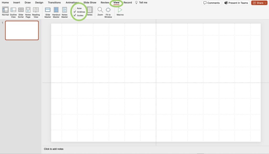
PowerPoint
If you’re using PowerPoint, it comes with a preset grid that you can just switch on; go to the ‘View’ menu and check the ‘Gridlines’ checkbox.
You can adjust the grid settings in the fly-out menu. For absolute accuracy, under ‘Grids and Guidelines,’ you can switch on ‘Snap Objects to Grid’ which will lock items in tightly to a gridline.
If you feel that the preset grid isn’t quite to your taste, you can use ‘Guides’ from the same menu and create a custom grid. To create more guides, grab a guideline while holding the ‘Option’ key on Mac, or the ‘Alt’ key on Windows.
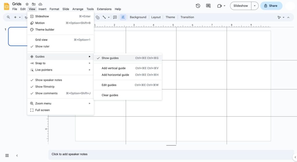
Google Slides
Google Slides does not have a preset grid option, so you will need to create one for yourself. This can be done by selecting ‘Show Guides’ under ‘Guides’ in the ‘View’ menu.
To make it easier, Google Slides measures the distance between guides for you, allowing you to space guides evenly.
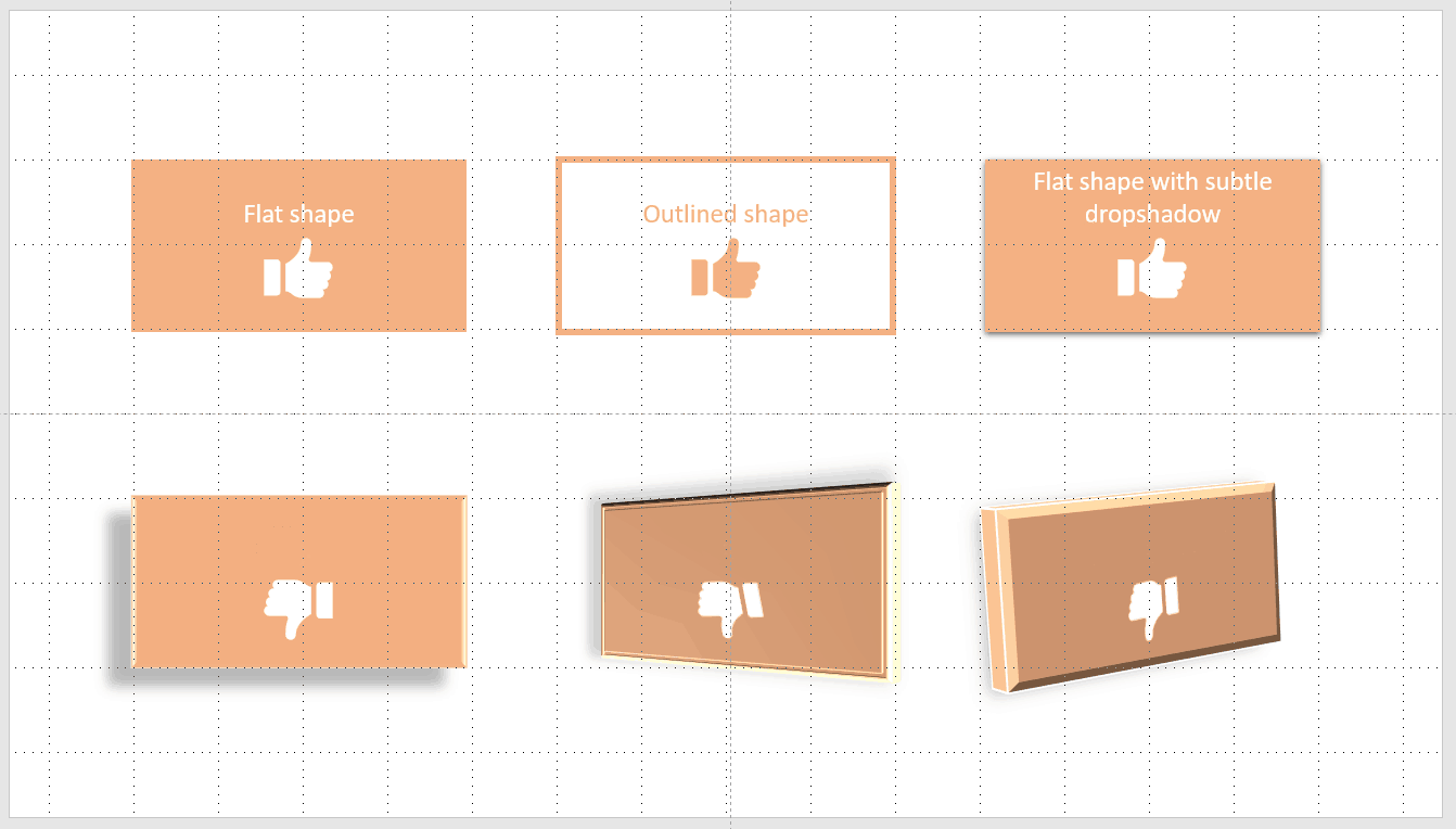
Graphic Design: Shapes and Graphics
Using graphic items such as shapes is an easy way to light up a presentation and provide emphasis for points or ideas. But unless you’re an experienced designer, it’s best to keep it simple.
For PowerPoint users, we suggest steering clear of the PowerPoint preset shapes; they’re overused and don’t look great in 95% of situations. Stick to subtle shape styles, like:
- Flat color or very subtle gradients.
- If you’re going to use drop shadows, keep them very subtle and use them sparingly.
- Avoid the bevel, 3D rotation, and reflection preset effects. They rarely look good, and in most situations look amateurish.
- If you’re using multiple shapes, stick to one or two colors. Using multiple colors will be distracting and unpleasant to look at.
Graphic Design: Color
In most presentation situations, it’s best to stick to your company’s brand colors when you need to use color. Your company’s brand colors have been professionally chosen to work well together. When choosing colors, one major goal is to have consumers recognize your brand by its branding colors— using a signature color increases brand recognition by at least 80%.
Additionally, using already having your company’s brand colors, takes the guesswork out of choosing colors and ensures your presentation looks ‘on brand’. This brand consistency can increase revenue by 10-20%.
If you’re not using a company brand color palette, restrict yourself to two colors (plus black). Decide on a color you want to use, and utilizing a tool such as Adobe Color, find a second color that works harmoniously with the color you selected.
Graphic Design: Fonts
When it comes to fonts, we suggest that it’s safest to work with a single font for your presentation.
If you understand a little about how to mix typefaces, you can pair two complementary typefaces. You can then use point size and weight (i.e. light, regular, bold, heavy, etc.) to create emphasis and hierarchy.
You can find open-source typefaces to use in your presentation over at Google Fonts, however, if this is a corporate presentation, stick to your company’s brand typeface.
| TIP: When looking for font ideas, try a website that provides free fonts and font pairings to use for your next design project. |
There are many styles and sub-styles of typeface, but broadly these fall into:
- Serif
- Sans Serif
- Display/Decorative
- Slab Serif
- Script
- Blackletter
- Monospace
- Handwriting
The main thing in a presentation situation is readability at a distance, so it’s safest to stick to Serif and Sans Serif typefaces. Do not use decorative type for body text— it will be unreadable in most situations.
The next piece of advice is extremely important: Do not use colored type. While some colored text might look good on your monitor it might be unreadable when projected. Yellow is particularly guilty of this.
| TIP: Looking for top branding strategies to stand out and win bids? Read our guide on Construction Branding for effecting branding tips to help you win more business. |
Graphic Design: Images
As the old saying goes “a picture is worth a thousand words”; in a presentation, an image is a powerful substitute for words.
How you place images onto a slide can either enhance your message or make your slides look like a jumble of old photos in a shoebox. Some things to consider when placing images into your presentation:
- When placing images on a slide, think alignment – does it look neat and tidy in relation to other elements on the slide, or does it look out of place?
- Never be tempted to try to squeeze an image onto a slide “to fill a space”; it’s likely to look out of place or scruffy.
- Never distort an image to make it fit into a space; respect the image’s aspect ratio.
- If you’re expanding an image to fill a whole slide, you will need a larger image or a high-resolution image. For example, expanding a low-resolution image with a size of 600 x 400, to 1200 x 800 will pixelate the image. When presented on a large screen or via a projector, the image will display very poorly.
Image Placement Ideas
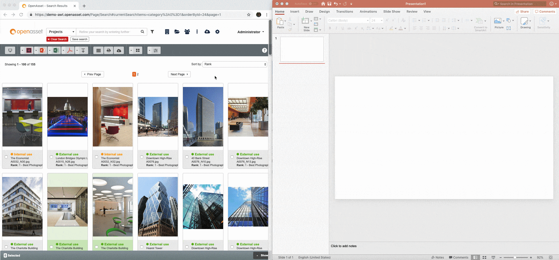
A great feature in OpenAsset is the ability to drag images directly from OpenAsset in your browser window, into your presentation without having to store the images on your PC.
Graphic Design: Charts
Keep charts simple— no 3D effects, no drop shadows and you should avoid using dozens of colors. You should look to avoid placing multiple charts on one slide; keep one chart per slide. The exception to this rule is where charts are related and it would help the audience to understand the data better.
Create Winning Slides Every Time With OpenAsset
If you’ve made it this far, you’ve basically had a crash course in graphic design. This all may seem like a lot to take in, but spending a little extra time on your presentation really can help you create something to impress your clients or conference with.
But, where can you store all of your graphic design content and marketing collateral? In a robust Digital Asset Management (DAM) software. Plus, when it comes to your brand, the best way to ensure brand consistency is by implementing a DAM solution to help you manage your ever-growing library of images, videos, logos, and media.
OpenAsset, a DAM designed for firms in the built world, is full of features that make storing and managing your AEC digital content so much easier, saving you time and money while keeping your brand consistent.
Ready to experience it for yourself? Schedule a demo with OpenAsset.