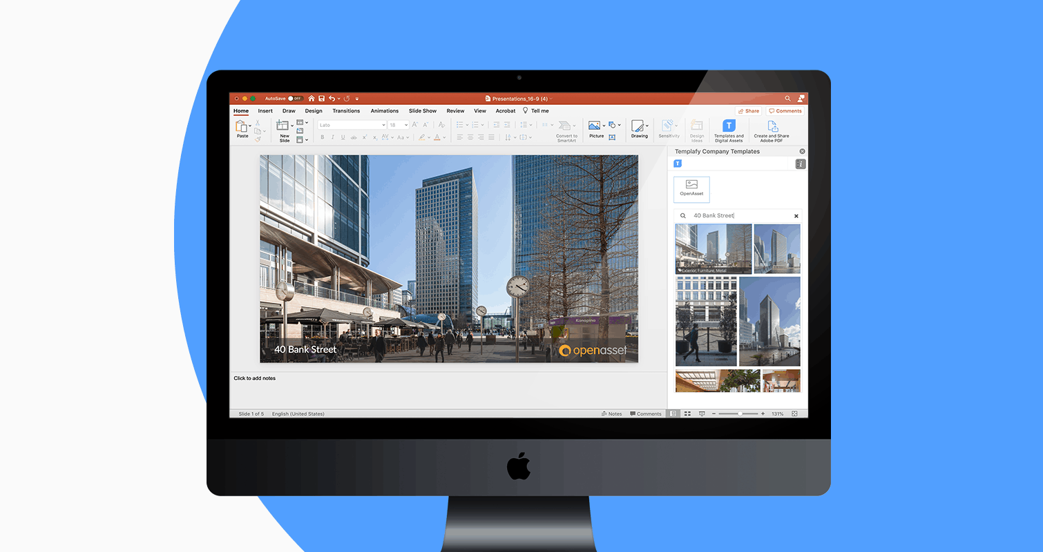
The OpenAsset file search offers comprehensive functionality but has remained largely unchanged for several years. We’re excited to announce that a revamp for search is on the way! The ultimate aim is making it easy for anyone to perform quick searches as well as improving the experience of filtering with multiple criteria. This is a significant project and will be delivered in phases over the coming months. In this post we’ll explain the aim for each phase and reveal some designs.
Phase 1
Those of you who have been using OpenAsset for a while will know that the Projects and Album pages have been upgraded to a new interface in recent times. We have also released the Employee Module to help better store, find and use employee information in your marketing and proposals. The Project, Album and Employee screens all have similarities with the aim of making the entire product easier to learn and use.
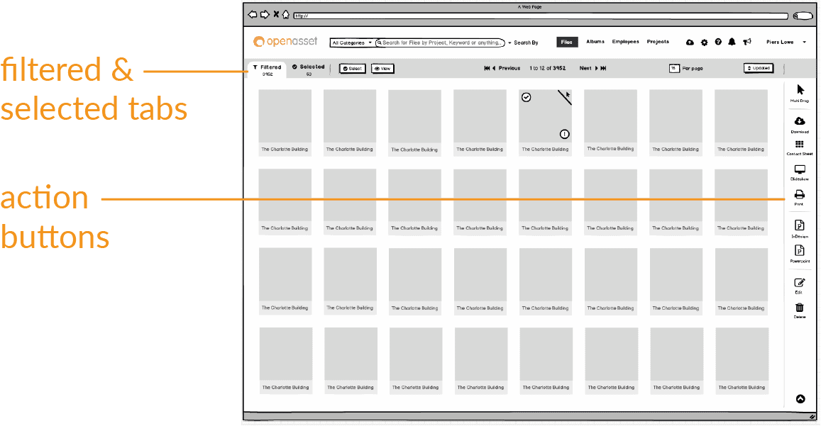
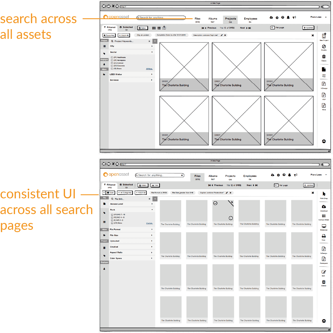
In phase 1 of search improvements we will bring the general layout of the File search in line with Projects, Albums and Employees. Notably:
- Tabs to easily switch between your “Filtered” and “Selected” views.
- Action buttons will be moved to a bar on the right hand side. These are typically used for taking action on your selection. For example, batch editing or generating documents from the selected files.
- The general design will be freshened up and consistent with the other pages.
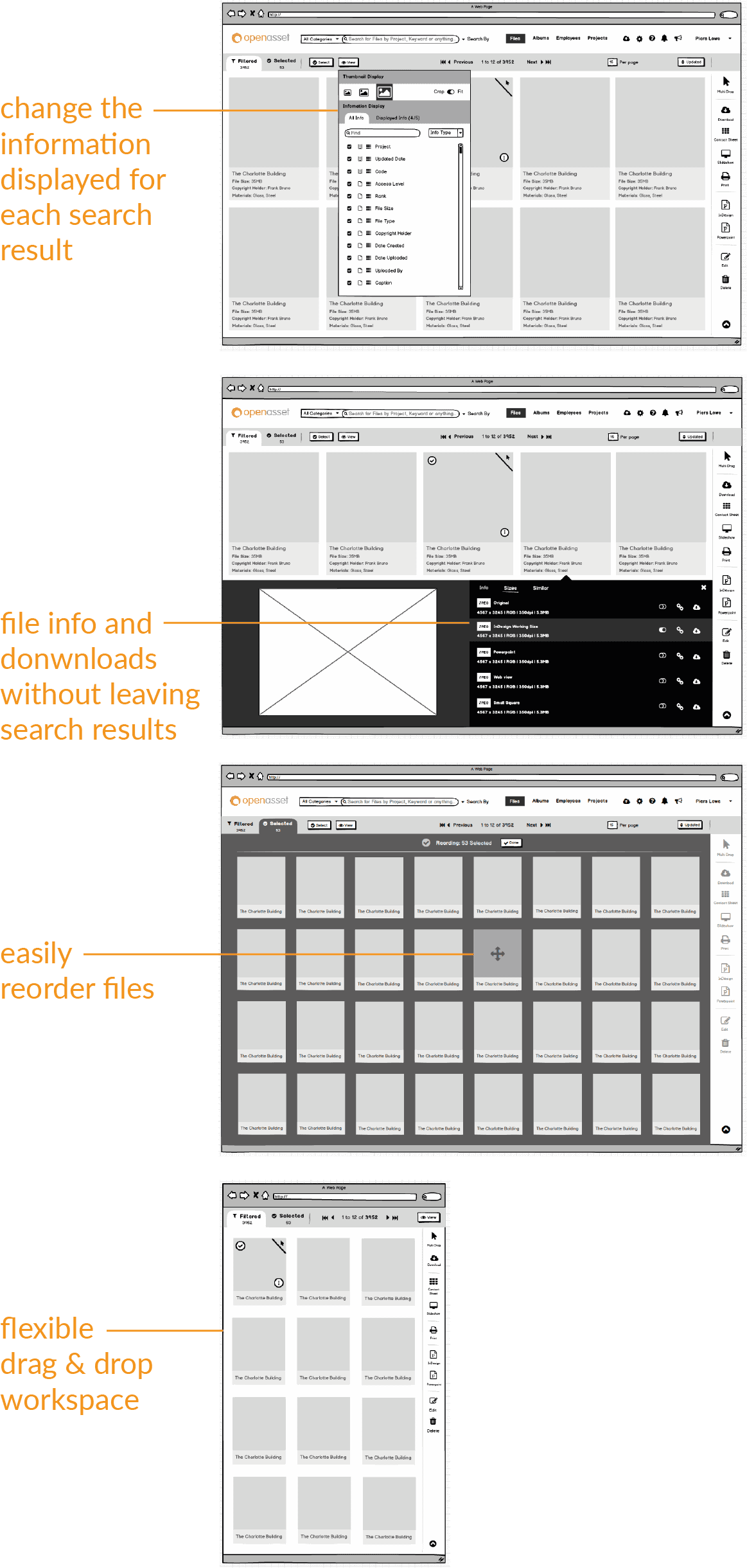
We are also rolling out some new improvements:
- Making it simple to change the viewable information under each search result.
- Easy access to general file information and downloads without leaving the search results.
- Easier ordering of items in Selections and Albums.
- Offering more flexibility with workspace setup. For example, better thumbnail and window resizing when setting up your drag and drop environment.
In Phase 1, whilst there will be several improvements to the search results the actual search functionality will remain the same until Phase 2.
Phase 2
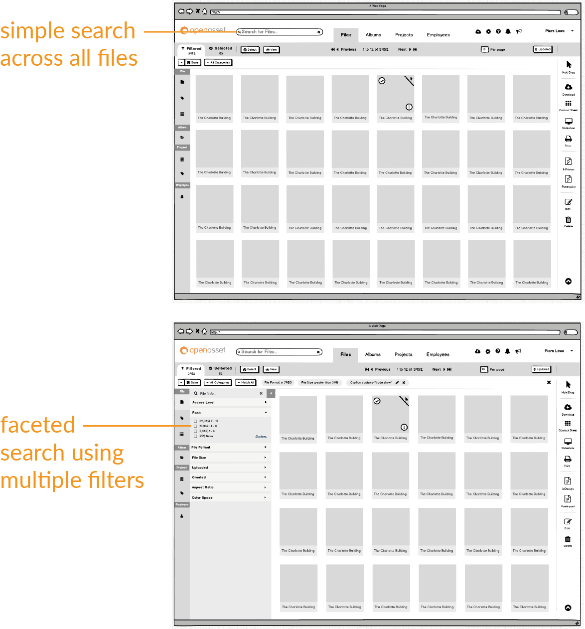
In Phase 2, we will replace the search engine that drives file search. This is where the experience of search will feel quite different. The aims are to:
- Make it easier to perform quick searches without understanding the data stored, projects or taxonomies etc.
- Make it more intuitive to perform searches using multiple filters on specific criteria.
To achieve this, the main search field at the top of the screen will be simplified to give a more “Google-like” experience. We hope this makes it easier for anyone to search in OpenAsset, including new or casual users.
Then for more specific filtering, optional controls will offer “faceting” across keywords, fields, projects and related data. This means that you will only see options that will lead to results and filters will show you how many results are available before using them. We hope this creates a more intuitive experience, leading to faster and more productive searches.
Phase 3
In Phase 3, we intend to implement the new search engine across all areas of OpenAsset. This means connecting the same powerful search across Projects, Albums and Employees as well as Files.
Once we do this the main search field will be able to search across everything. We will also work to make further design consistency across the different search result pages in OpenAsset.
Your Feedback
We would like to hear from you if you would like to feedback or discuss this project. To do this please reach out to your Customer Success manager so they can put you in touch with our product team directly.


